https://www.youtube.com/watch?v=vBcBc1NqRQY- the video we emulated
We decided to emulate a stop motion in which it's all about cooking and the aspect of cooking. We liked this idea of adding food into our stop motion so we chose to do cupcakes and how they make themselves. We also decided to add a storyline behind this emulation compared to the video we are emulating in which there was not a storyline behind it. We added some dialogue within this stop motion film and emotions of these cupcakes almost like they are impersonating reality except as cupcakes. I thought it would be unique because its not too serious and not too silly and contrast the both. Because they are just cupcakes making themselves we all thought it would be cool to add that and this stop motion captured that aspect because it has a clear storyline of these non human like objects and the content of it portraying real life seemed fun to create. Although the plot isn't too serious, it shows happiness within which is the main point of our stop motion animation. Overall, it was a very fun project to do and I love how we displayed certain techniques within this and I'm happy with the way it turned out.
Wednesday, June 10, 2015

Friday, May 15, 2015
Project 11-Utopia vs Dystopia Silent Films
https://www.youtube.com/watch?v=ryIUthehyao&feature=youtu.be&safe=active
https://www.youtube.com/watch?v=4Q-nG5yae2o


Monday, April 27, 2015
Project 9- Two Portraits/Commercial & Fine Art
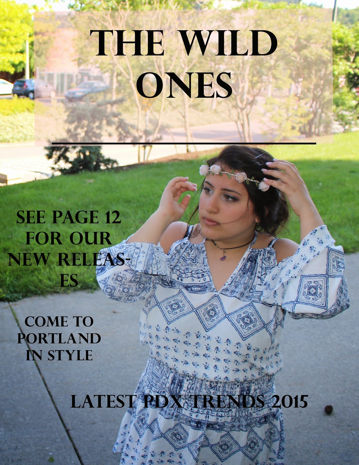
Commercial Magazine #1

Commercial Magazine #2

Fine Art #1

Fine Art #2

Fine Art #3

Friday, April 24, 2015
Blog PreWork
Fine Art Portraits


I really liked the tone these two images had behind it. The black and white somewhat brings out the contrast and their features which I love. It captures the main aspect. It also brings out their characteristics to life. Overall, I loved the lighting that both of these portraits contain and the way they are both taken/portrayed.
Magazine covers


By, Alberto Leyva
By, Victor Lacerrieu
I loved these two magazine covers because they both capture very different styles. One tends to be more artsy and filled with vibrant colors to capture the essence of her face and the second one is more simplistic yet brings it to life with just subtle colors which I personally find very interesting.
Monday, March 30, 2015
Project 8- Surrealism and Photomontage
For Project 8, our task was to combine five different components for three different photographs. I was inspired by different aspects of this project and decided to take some pictures of animals while at the zoo and add to different landscape backgrounds. I edited the contrast a little bit to make it took realistic but overall I didn't edit too much. Overall, it was a fun project.


Monday, March 9, 2015
Surrealism
Surrealism is a 20th-century avant-garde movement in art and literature that sought to release the creative potential of the unconscious mind, for example by the irrational juxtaposition of images.

Adrian Limani

Antonio Mora
Project 7- Alternative Process through Digital Means
For Project 7, I went around downtown and through the Pearl District to capture images of buildings and tree's because I thought the effects would look really cool on that type of photography. I didn't edit my images too much, just to fit each category (saturation, vibrance, black and white..etc)
Daguerreotype

Cyanotype


Daguerreotype
Cyanotype
Gum Bichromate
Friday, February 13, 2015
Project 6-Multiple Image Techniques
For Project 6, we learned three different techniques (Panorama, Multiple Exposure & HDR) It required taking multiple different photos and made them all fit together. I took most of these photos downtown and didn't edit it too much because I really liked how my panorama and multiple exposure turned out...I mainly just edited the brightness and contrast. For my HDR, I brought all the colors out and edited each aspect of it highlighting the main color and vibrance. I took my HDR photo on the highest floor of a hotel room over a sunny weekend in Portland last week. I enjoyed taking these photos and all the techniques involved in Project 6.
Panorama:


Multiple Exposure:


HDR:

Wednesday, January 28, 2015

Friday, December 5, 2014
Project 4-Balance and Contrast
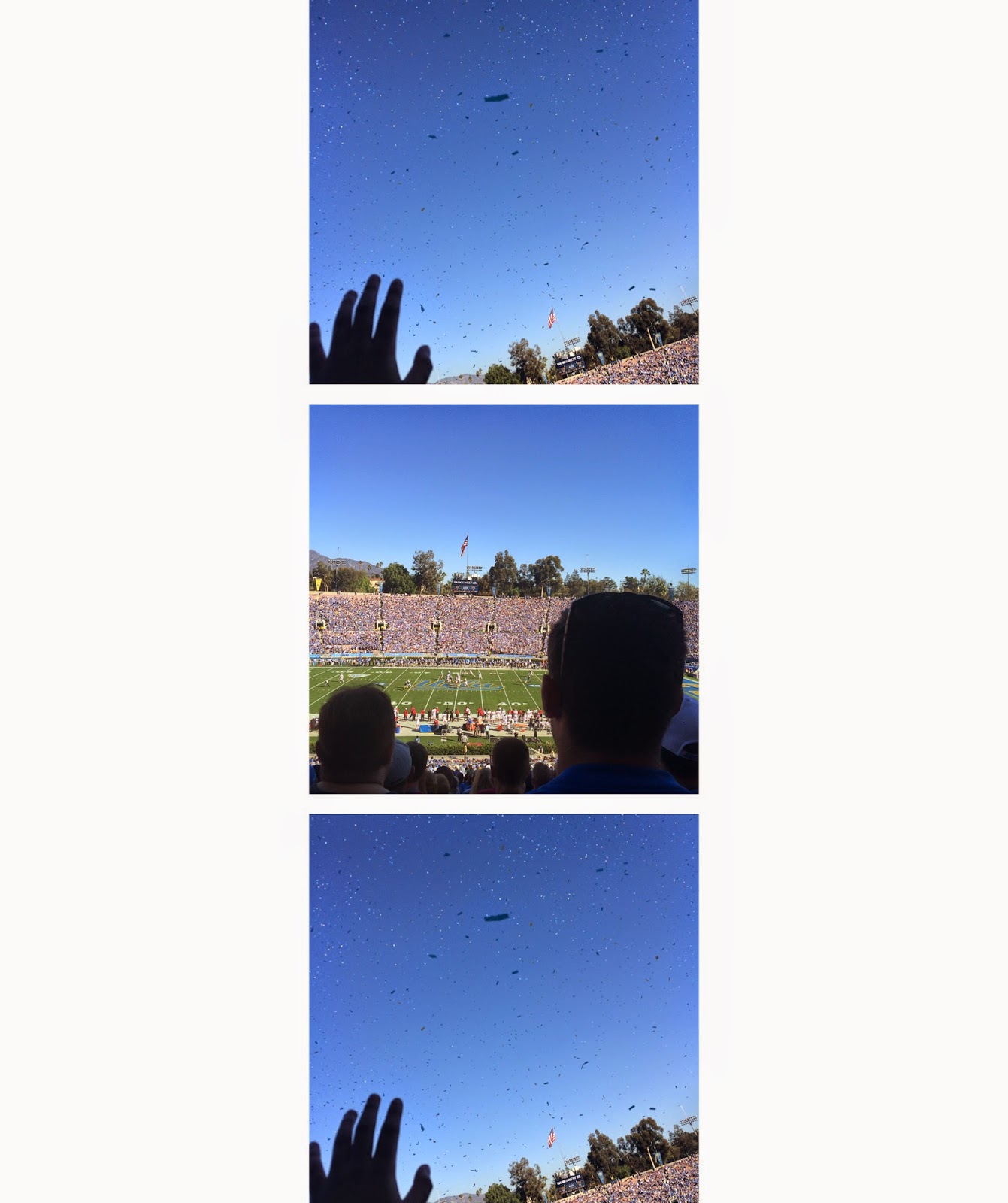
For Project 4 (Balance and Contrast), our task was to take a few pictures that were different and somewhat similar and to be able to tell a story with diptych's and triptych's. Also, we were able to create different types of kaleidoscopes using images we took on the walking field trip to PSU. I took photos of a wall that had a unique look to it a piece of artwork I saw and, a bench. I had a lot of fun creating diptych's triptych's and, kaleidoscope's using cool effects. I mostly changed, the brightness, background color and clarity. I did this to show the contrast between the diptychs and triptychs. I mostly changed the background color for the kaleidoscopes. I took these photos near PSU (kaleidoscopes and diptych's). My triptych's I took in California over Thanksgiving break at the Rose Bowl Stadium. I thought it was a cool atmosphere so I decided to snap a few pics.
 |
 |
 |
 |
 |

Wednesday, December 3, 2014
Mood Photo
For this photo I brought out the background such as the clouds by highlighting the blue and purple colors. I thought this really showed the mood and made it a calm and peaceful setting to the image.

Project 3- Color and Grids
For this project we had to explore a variety of colors. We used certain colors to highlight main aspects of the photo we had taken. We figured out how color affects the mood and how it can be used for emphasis on an image. Once we had a photos, we were able tog on light room and use all these techniques with color to make grids.
 cool color
 color complement

 monochrome

warm color
Wednesday, November 12, 2014
Color Post


Mood: I think the photographer used the amount of light they had in this field to set the mood and really create a dark yet relaxing mood to this image.

Tone: The photographer used the reflection of the tree's around the water to set the tone. This tone is soothing yet brings out the color around the image.
Wednesday, October 29, 2014

Friday, October 24, 2014
Project 2-Framing And Composition
For Project 2, we were given a list of photography terms that we had to photograph (diagonals, leading lines, close up, filling the frame, frame within a frame, rule of thirds, birds view, and bugs eye view) I was determined to photograph my own photos to fit each term and make them unique. We went on several different walking field trips to the Pearl District to photograph the beauty of downtown Portland. It gave me a great opportunity to take pictures of, buildings, nature, signs, and the Portland atmosphere. I chose the ones I'am posting because I thought they fit each criteria in a different way and they had a different look behind them which made it interesting to me. I wanted to edit these photos to make them all stand out from one another so I mostly changed the highlighted color in the background, changed it to black and white or, changed the saturation and clarity so that you could tell the detail throughout each photograph.
 Leading Lines
 Bug's Eye View
 Frame Within A Frame
 Rule Of Thirds
 Bird's Eye View
 Diagonals
 Close Up
Filling The Frame

Filling The Frame
Subscribe to:
Posts (Atom)